
Quiet Reading on Busy Websites: A Scientific Guide to Reducing Visual Noise
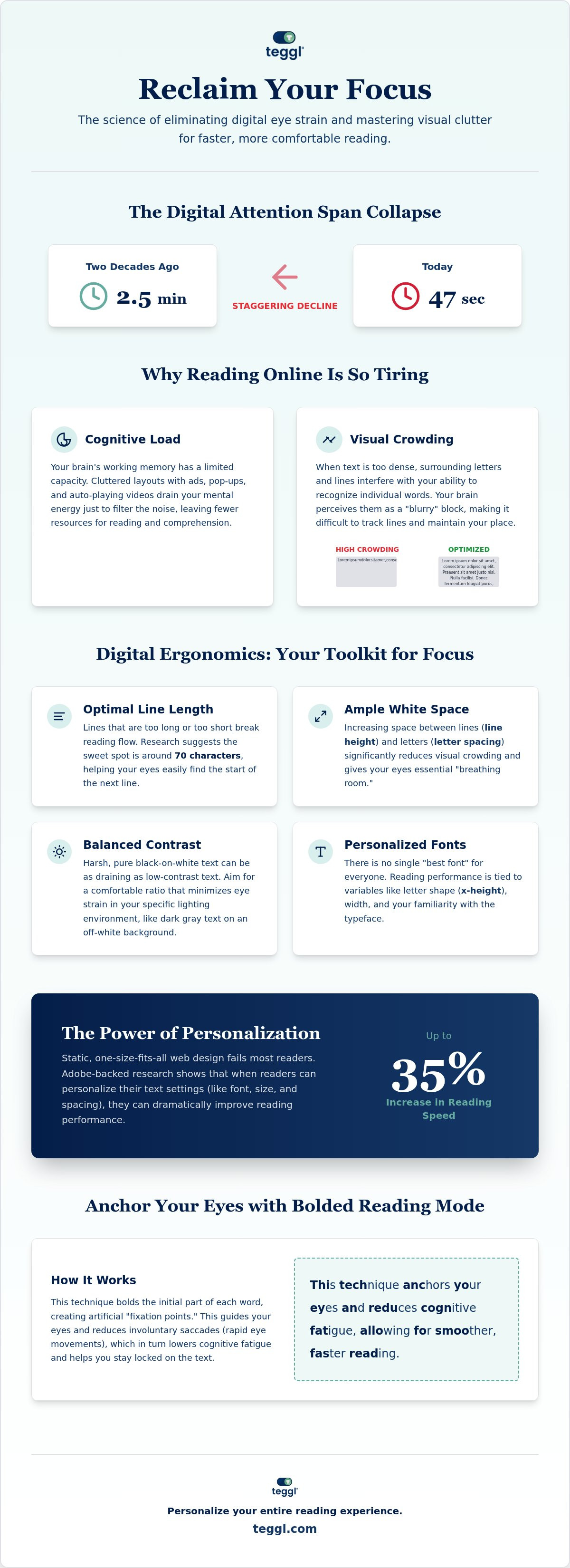
The average attention span on a digital screen has plummeted to a mere 47 seconds, a staggering decline from the two and a half minutes we enjoyed just two decades ago. You've likely felt the physical toll of this shift. Your eyes burn, you lose your place in dense blocks of text, and every flickering sidebar feels like a personal attack on your concentration. It's becoming nearly impossible to achieve rustig lezen op drukke websites without a deliberate strategy to silence the visual noise.
We're here to help you take back control. You'll learn how to reclaim your focus and eliminate digital eye strain by mastering the science of visual crowding and personalized typography. By understanding how your brain processes information, you can stop fighting the layout and start reading with ease. This guide breaks down the mechanics of cognitive fatigue and introduces the transformative power of adaptive reading profiles. We'll show you exactly how to optimize your digital environment for maximum speed and comprehension.
Table of Contents
The Science of Visual Distraction and Cognitive Load on the Web
Most websites aren't designed for deep reading; they're designed for high-speed scanning and ad impressions. This creates a fundamental conflict when you're trying to achieve rustig lezen op drukke websites. Your brain has to work overtime to filter out flashing banners, auto-playing videos, and high-contrast sidebars. This constant battle triggers the "pop-out" effect, where involuntary attention shifts occur because your primitive brain is wired to notice sudden changes in its environment. These distractions aren't just annoying; they physically drain your mental battery.
To better understand how to simplify your browsing experience, watch this helpful video:
At the heart of this struggle is Cognitive Load Theory. This scientific framework explains that our working memory has a limited capacity. When a layout is cluttered, your brain drains mental energy just trying to navigate the mess before you've even processed a single sentence. This leads to "Visual Stress," a state where reading endurance drops and comprehension suffers because your cognitive resources are exhausted by the environment itself.
Visual Crowding and Text Density
Visual crowding is a specific phenomenon where surrounding characters interfere with your ability to recognize individual words. When text is too dense, letters begin to "blur" for the brain. Scientific research indicates that increasing letter spacing and line height can significantly mitigate these effects. By creating more physical space between characters, you reduce the noise that prevents your brain from anchoring on the text, making it easier to track lines without losing your place.
The Problem with Static Web Design
Traditional web design is built for the "average user," but this static approach ignores individual neurodiversity and personal visual preferences. What feels clean to one person may be "visually loud" and overwhelming to another. To achieve true rustig lezen op drukke websites, you need a user-controlled environment. Shifting from a static layout to an adaptive one is essential for deep work, allowing you to customize typography to match your unique cognitive processing speed and sensory needs.
Digital Ergonomics: Practical Strategies to Quiet a Busy Website
To achieve rustig lezen op drukke websites, you must look beyond just hiding ads. Digital ergonomics focuses on the physical and cognitive relationship between the user and the screen. Leeds research suggests that a line length of approximately 70 characters is the "sweet spot" for focus. If lines are too long, your eyes struggle to find the start of the next line; too short, and the constant rhythmic jumping breaks your flow. You can improve this by adjusting margins and increasing line height to provide essential "breathing room" for the eyes. These adjustments align with Harvard's digital accessibility principles, which emphasize that readability is a product of deliberate design choices.
Contrast management is equally vital to prevent "flicker fatigue." Harsh black-on-white text can be as draining as low-contrast layouts that make characters hard to distinguish. Aim for a balanced text-to-background ratio that feels comfortable in your specific lighting environment. Interestingly, research challenges the idea of a universal "best font." While specialized "dyslexia fonts" are popular, personalization often outperforms them in speed tests. There isn't one perfect typeface; there's only the configuration that works best for your unique visual system.
The Role of Typography in Visual Ergonomics
University of Essex research highlights that x-height (the height of lowercase letters) and character width significantly impact legibility. Familiar fonts like Verdana often outperform specialized typefaces in search-reading tasks because our brains are already optimized to recognize their specific patterns. Instead of searching for a magic font, focus on adjusting the scale and spacing of familiar ones to suit your needs. You can discover your optimal reading settings to see which typographic variables have the biggest impact on your comprehension.
Environmental Control Tools
You don't have to accept a website's default layout. Browser extensions can strip away non-essential visual elements without breaking functionality. Tools like "Reading Rulers" are also highly effective for maintaining your place and reducing line-skipping in dense text blocks. These digital aids allow you to create a "sanctuary mode" on any page, ensuring that the layout serves your focus rather than competing for it.
Personalised Reading Technology: Reclaiming Focus with Teggl
Manual adjustments to line length and white space provide a solid foundation for focus, but true rustig lezen op drukke websites requires a more sophisticated, active intervention. Static websites can't account for the unique way your brain processes visual information. Teggl functions as an adaptive typography platform that transforms cluttered web pages into personalized reading environments. Research from Adobe highlights the power of this approach, demonstrating that individuals read up to 35% faster when using font settings optimized for their specific visual needs.
By using technology to silence the noise, you significantly reduce the mental resources required to operate a system. This shift allows your cognitive energy to flow toward comprehension and retention rather than being wasted on filtering out distractions. Teggl moves beyond the limitations of standard browser tools by offering a comprehensive solution that adapts to you, not the other way around.
Beyond Static Fonts: Why Personalization Matters
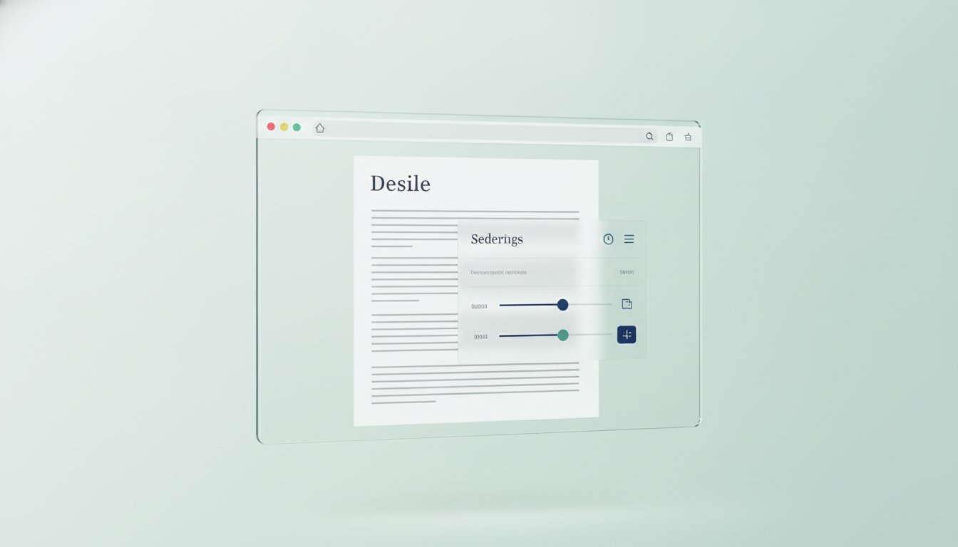
Reading performance isn't the result of a single "perfect" font. It's a delicate harmony of variables including size, spacing, and contrast. Teggl identifies your unique "reading fingerprint" through a performance-based Reading Profile Test. This test moves you away from guesswork and toward data-driven settings that match your cognitive processing speed. It ensures that every page you visit is automatically recalibrated to meet your peak performance standards.
Implementing Bolded Reading for Enhanced Focus
To further anchor your attention, Teggl introduces the Bolded Reading Modus. This feature emphasizes the initial characters of words, creating visual "anchor points" that guide your eyes across the page. This mechanism reduces involuntary eye wandering and prevents the frustration of line-skipping in dense text blocks. You can experience these immediate improvements in visual clarity by adding the Teggl extension to your browser. It's the most direct path to achieving rustig lezen op drukke websites while protecting your long-term cognitive well-being.
Take Control of Your Digital Reading Environment
Visual noise is more than a minor annoyance; it's a physiological barrier that drains your mental energy and slows your progress. You've learned that by understanding visual crowding and applying ergonomic benchmarks like optimal line length, you can begin to silence the clutter. Achieving rustig lezen op drukke websites is no longer a matter of sheer willpower. It's about using evidence-based tools to align digital text with your unique cognitive needs.
Personalization is the ultimate key to peak performance. Adobe research demonstrates that the right font settings can increase reading speed by as much as 35%. By moving beyond static layouts and embracing an adaptive typography platform, you reclaim your focus and protect your well-being. This technology integrates seamlessly into your existing browser workflow, allowing you to focus on the content that matters most without the friction of eye strain.
Ready to transform your experience? Discover your optimal reading settings with the Teggl Reading Profile Test and start reading with newfound clarity and speed today. You deserve a digital world that works for you.
Frequently Asked Questions
What is visual crowding and how does it affect my reading speed?
Visual crowding is a phenomenon where surrounding characters interfere with your ability to recognize individual words. It forces the brain to expend extra mental energy filtering out adjacent letters, which significantly reduces identification speed and increases the likelihood of errors. When you mitigate this "blur" through increased letter and line spacing, your reading speed and comprehension naturally improve because your brain can anchor on each word more efficiently.
Can changing my font really reduce visual distraction on a website?
Yes, but the real power lies in personalization rather than switching to a single "best" font. Adjusting variables like x-height, character width, and letter spacing allows you to achieve rustig lezen op drukke websites by matching the text to your specific visual processing speed. Research from Adobe indicates that using personally optimal settings can increase reading speed by as much as 35%, proving that a tailored environment is superior to any standard typeface.
Why do I get eye strain even when a website looks "clean"?
Eye strain often stems from poor digital ergonomics, such as sub-optimal line lengths or improper contrast ratios, even on minimalist sites. If lines exceed the recommended length of approximately 70 characters, your eyes must work harder to track back to the start of the next sentence. This physical effort, combined with insufficient line height, causes significant cognitive fatigue and physical discomfort regardless of how many ads or sidebars are removed.
Does Bolded Reading help with ADHD or dyslexia-related distractions?
Bolded Reading Mode helps by creating visual anchor points at the beginning of words, which reduces involuntary eye wandering and line-skipping. While it isn't a cure for conditions like ADHD or dyslexia, it acts as a supportive tool to stabilize your focus and reduce the effort required to stay on track. This anchoring effect is particularly helpful for anyone who struggles with attention shifts or finds it difficult to navigate dense blocks of text during long reading sessions.
Comments