
Reducing Cognitive Load While Reading: A Scientific Approach to Digital Focus
Why does finishing a complex digital report often feel more physically draining than a morning at the gym? If you've struggled with visual crowding or the constant need to re-read the same paragraph, you aren't alone. This exhaustion stems from a bio-mechanical bottleneck in how our brains process pixels versus paper. For those seeking to reduce cognitive load while reading, the solution isn't found in more caffeine or stricter discipline. It's about optimizing your visual environment to match your unique neural processing needs.
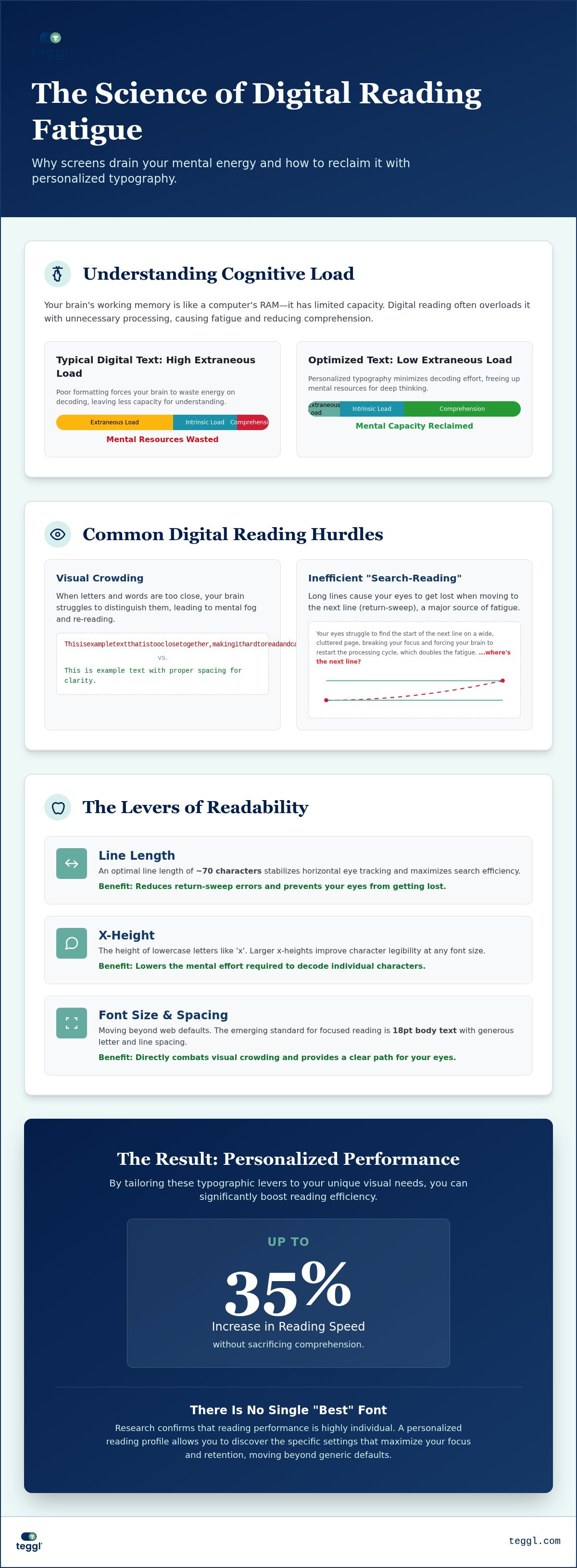
We agree that the modern digital workflow is relentless, but your reading experience shouldn't be the primary source of your daily fatigue. This article promises to show you how to minimize mental strain and maximize information retention using evidence-based typographic strategies. We'll explore the latest research on adaptive typography, explain why the 18pt body text standard of 2026 is a game-changer for focus, and show you how a personalized reading profile can increase your speed by up to 35% without sacrificing comprehension. It's time to reclaim your mental energy and master the art of digital deep work.
Key Takeaways
Distinguish between intrinsic and extraneous cognitive load to identify exactly why digital texts feel more draining than printed pages.
Master the primary typographic levers, such as x-height and line length, to optimize your visual ergonomics for maximum search efficiency.
Implement scientifically-backed strategies to cognitieve belasting verminderen lezen and reclaim the mental energy lost to poor screen design.
Move beyond generic font choices by using a Reading Profile Test to discover the specific settings that maximize your individual comprehension.
Establish a sustainable digital workflow that reduces mental fatigue and eliminates the need for frequent re-reading of complex paragraphs.
Table of Contents
The Mechanics of Cognitive Load: Why Digital Reading Drains Your Brain
Digital reading is more than a mental exercise; it's a physical coordination task. To understand why your brain feels fried after an hour of scrolling, we have to look at Cognitive Load Theory. This framework describes the total amount of mental effort your working memory uses at any given time. Think of your working memory as the "RAM" of your brain. It has a strictly limited capacity. When you read, you're balancing two types of load: intrinsic and extraneous.
Intrinsic load is the inherent difficulty of the subject matter. You can't change the complexity of a legal contract or a technical manual. Extraneous load, however, is the mental energy wasted on how that information is presented. If the font is too small or the lines are too long, your brain burns through its "RAM" just trying to decode the symbols. This leaves less room for actual comprehension. By focusing on ways to cognitieve belasting verminderen lezen, you're essentially freeing up mental processing power for the things that matter.
One major culprit of this drain is "Visual Crowding." This happens when letters and words are packed too tightly together. Your brain struggles to distinguish individual characters, causing them to blur in your peripheral vision. It's a decoding tax that leads to mental fog and physical eye strain. It forces you to work harder just to see the words, let alone understand them.
The Visual Bottleneck in Digital Environments
Screens introduce a unique challenge called "search-reading." This is the eye's constant, exhausting struggle to find the start of the next line on a cluttered page. Extraneous cognitive load is the unnecessary mental energy spent on decoding poorly formatted text rather than understanding its meaning. When your eyes skip lines or lose their place, your brain has to restart the processing cycle, which doubles the fatigue you feel by the end of the day.
Why Standard Web Fonts Are Often Sub-Optimal
We've been told for decades that fonts like Arial or Times New Roman are the gold standard. However, Adobe Research has confirmed that there is no single "best" font for everyone. Standardizing on these generic options can actually hinder reading speed for a significant portion of readers. Reading performance is highly individual; what works for a colleague might cause you to re-read the same paragraph three times. Adaptive typography platforms like Teggl move beyond these static defaults, allowing you to tailor the visual experience to your specific neural needs and effectively cognitieve belasting verminderen lezen.
Scientific Levers for Readability: Optimizing Your Visual Ergonomics
Readability isn't a mystery; it's a series of mechanical choices. To effectively cognitieve belasting verminderen lezen, you must adjust the levers of x-height, character spacing, and line length. Research from the University of Leeds highlights that an optimal line length sits at approximately 70 characters. This specific width maximizes search efficiency, preventing the eye from wandering. When lines are too long, the return sweep to the next line becomes a cognitive hurdle that slows you down.
Visual anchors provide a stable path for your focus. These anchors prevent the eye from losing its place in a sea of pixels, acting like a 'Reading Ruler' for the digital age. This is especially vital given the effect of the digital era on memory, where screen-based distractions constantly compete for our limited working memory. By creating a clear visual path, you reduce the effort required to simply stay on the page.
The Impact of Font Size and X-Height
Proportions matter more than style. University of Essex research found that larger x-heights, specifically around 5.0mm, can raise a reader's measured reading age and speed. In visual search tasks, the font 'Verdana' often outperforms 'Sassoon Primary' because its specific proportions reduce character confusion. It's not just about making text bigger; it's about making it clearer. You can discover your optimal reading settings to see how an adaptive typography platform adjusts these proportions for your unique visual needs.
Bolded Reading: Guiding the Eye to Reduce Effort
Our eyes don't move smoothly across a page. They jump in rapid bursts called saccades. Bolded Reading leverages this biology by bolding the initial characters of words. These bolded segments act as a 'hook' for the eye, guiding it to the core meaning of a word faster. This reduces the cognitive effort of word recognition and significantly aids those in high-distraction environments. It's a powerful way to cognitieve belasting verminderen lezen by streamlining the decoding process before your brain even begins to process the sentence structure.
Adaptive Typography: Building Your Personalized Focus Profile
Theory is only useful when it's applied. While understanding the levers of typography is the first step, the real transformation happens when you move from generic "best practices" to personalized performance data. Our current digital environment is flooded with interruptions. A recent meta-analysis on digital distractions confirms that these visual and auditory breaks significantly impair comprehension by overloading our working memory. To combat this, you need a reading environment that adapts to your unique neural profile rather than forcing you to adapt to it.
Moving Beyond Subjective Preference
It's a common trap: we often "prefer" fonts that are familiar, even if they make us read slower. Studies on specialized fonts like Dyslexie show that while users might enjoy the aesthetic, their objective performance doesn't always improve. Data-driven settings are the only way to ensure true cognitive load reduction. By utilizing a Reading Profile Test, you can identify the specific character spacing and x-height that maximize your individual speed. This shift from aesthetic choice to performance-based optimization is the most effective way to cognitieve belasting verminderen lezen.
Integrating the Teggl Browser Extension into Your Workflow
You can instantly transform any website into a focus-optimized workspace with the Teggl Browser Extension. It allows you to customize Bolded Reading intensity and typography based on your specific Reading Profile Test results. This ensures a consistent, high-performance environment across newsletters, research papers, and long-form articles. We invite readers to discover their optimal reading settings to regain hours of lost focus and eliminate mental "fog."
Digital Reading Audit Checklist:
Set body text to at least 18pt for long-form content to minimize strain.
Adjust line length to approximately 70 characters for maximum search efficiency.
Enable Bolded Reading Mode to guide saccadic eye movements.
Remove extraneous visual elements like sidebars and distracting advertisements.
Use a personalized reading profile to cognitieve belasting verminderen lezen.
Reclaim Your Digital Focus and Mental Energy
Digital reading is a bio-mechanical challenge that requires more than just willpower. We've explored how extraneous load drains your working memory and how specific levers like line length and Bolded Reading can mitigate this fatigue. By applying these evidence-based principles, you can effectively cognitieve belasting verminderen lezen and finish your workday with a sense of clarity rather than exhaustion.
Research from institutions like Adobe and the University of Leeds proves that reading performance is deeply individual. Whether you're a knowledge worker managing complex reports or a student tackling dense academic papers, your environment should adapt to you. Data shows that personalized typographic settings can increase reading speed by up to 35% while maintaining high comprehension levels. It's time to stop fighting your screen and start optimizing your visual workspace for peak performance.
Take the Reading Profile Test and start reducing your cognitive load with Teggl. You have the power to transform every pixel into a tool for deep work. Start your journey toward a more sustainable and efficient digital workflow today.
Frequently Asked Questions
How can I reduce cognitive load while reading long digital documents?
You can reduce cognitive load by adjusting typographic variables such as line length, font size, and spacing. Aim for a line length of approximately 70 characters and a body text size of 18pt to minimize visual strain. These adjustments help your brain focus on meaning rather than decoding. This is one of the most effective ways to cognitieve belasting verminderen lezen during long work sessions.
Does font size actually affect how much I remember from a text?
Font size significantly affects retention because it controls the amount of mental energy spent on visual decoding. When text is appropriately sized, your working memory isn't overwhelmed by the mechanical effort of reading. Studies suggest that larger sizes, like 18pt, allow for better focus on the narrative or data. This shift in energy usage directly improves your ability to synthesize and recall complex information from digital sources.
What is Bolded Reading and how does it help with focus?
Bolded Reading is a typographic feature that highlights the first few letters of words to anchor your visual attention. This method guides your saccadic eye movements, which are the rapid jumps your eyes make while scanning text. By providing these visual hooks, the technology reduces the time your brain spends identifying each word. It helps prevent line-skipping and keeps you focused on the content even in high-distraction digital workspaces.
Is there a specific font that is best for people with ADHD or dyslexia?
Research indicates that no universal font exists for ADHD or dyslexia; reading performance is highly individual and depends on multiple variables. Factors like x-height, contrast, and character spacing play a more significant role than the specific font name. Instead of searching for a "magic" font, use a Reading Profile Test to discover your unique requirements. This data-driven approach ensures you find the settings that actually cognitieve belasting verminderen lezen for your specific needs.
Can I increase my reading speed without losing comprehension?
Yes, optimizing your visual environment can increase reading speed by up to 35% without sacrificing comprehension. By removing the extraneous load caused by poor typography, you free up mental RAM for faster information processing. When your eyes move efficiently across a page with optimal line lengths and spacing, your brain can absorb concepts at a much higher rate. This creates a sustainable workflow that maintains deep focus throughout the day.
Comments